The Ontario Association of Insolvency & Restructuring Professionals

The Ontario Association of Insolvency & Restructuring Professionals (OAIRP) is one of nine provincial sub-associations under the Canadian Association (CAIRP). As a sub-association, their branding had to stand out without deviating from the national branding standards.
“A brandmark with Ontario related imagery, keeps in line with national standards of font and colour, stands out more than the current square brandmark.”
— CLIENT WISH LIST
The original brandmark did not identify or allude to the association as Ontario-based and several of the other eight provincial associations were using block style brandmarks as well.
Client: OAIRP The Ontario Association of Insolvency & Restructuring Professionals
Role: Brand Development
Brief: A brandmark with Ontario related imagery, keeping in line with national standards of font and colour, but stands out more than the current square brandmark.

Matching the national branding style was an important factor to the association when implementing a new logo. There had to be a balance between standing out, but fitting in. When creating the new logo, I focused on the fonts and colour palette remaining the same and created options that fit into that palette.
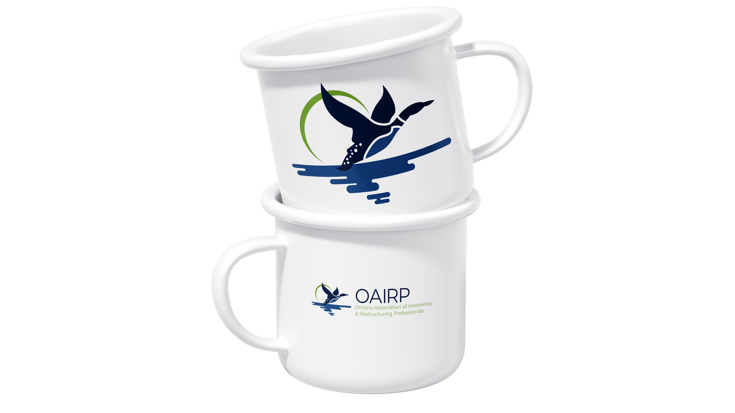
By moving away from a framed-in or block style, the Loon was able to break the mold on CAIRP provincial brandmarks while still matching the overall brand standards.