Christian Farmers Federation of Ontario

There were a few factors leading the CFFO to a branding update. Competition for members, inconsistency in their visual identity, and the desire to stand out from other organizations who had recently been confusing their messaging.
“Identifiable and scalable, doesn’t lean on Christian symbols (we are open to members of any religion), avoid confusion with religious non-profit groups, a badge style for the brandmark would be ideal.”
— CLIENT WISH LIST
It was settled early on in the process that the Christian imagery would be cut altogether. However, the CFFO was not permitted to add any industry specific imagery either; no cattle, grain, or other images that one could relate to agriculture or farming. The CFFOs members were from all different types of agricultural backgrounds so focusing on only one would appear biased and unfair.
Client: CFFO Christian Farmers Federation of Ontario
Role: Brand Development
Brief: Create a new brand identity in a badge style that does not lean on Christian symbols.
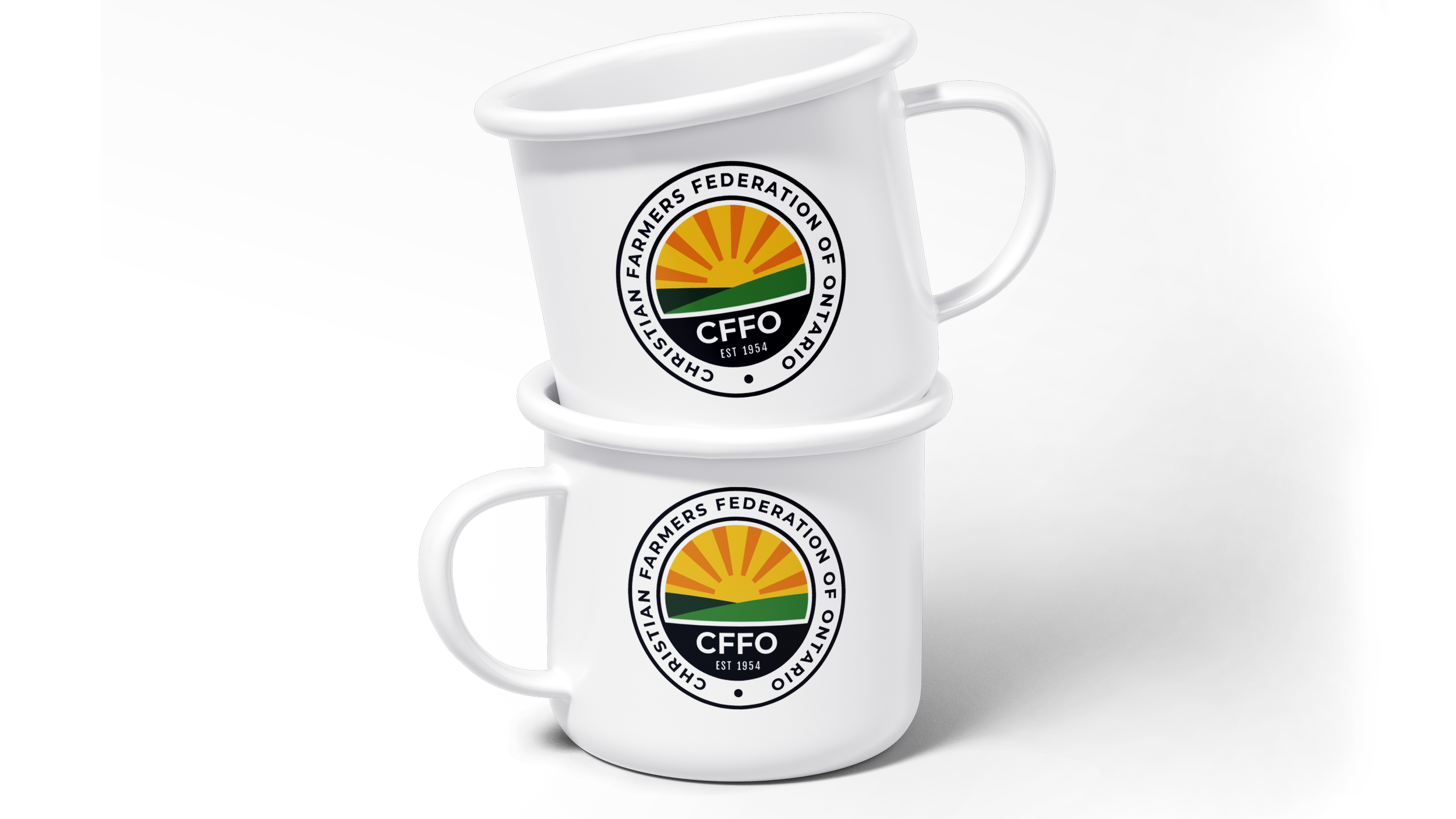
The sun and fields - which had been staples in previous versions of the logo over the years - kept the content of the badge identifiable to all who knew it, despite the modernization of the styling.

Being able to contain the brandmark to a badge option was an important aspect of the branding update. One of the CFFOs goals for the new logo was to incorporate it into merchandise for tradeshows and for sale through their website. A badge version was the best option for them to use for member’s merch across the board.
