Prehabilitation

The American PreHabilitation Society had a very short brief: a simple layout, options for page elements, all using their current logo as a base. The purpose of the site was to be an informational resource for members of the professional society and patients, so easy legibility and good page content hierarchy were key for their users.
Client: Progressive Web Solutions
Role: Web Design
Brief: Create a home page and interior page design using modular elements that can be replicated across additional interior pages.
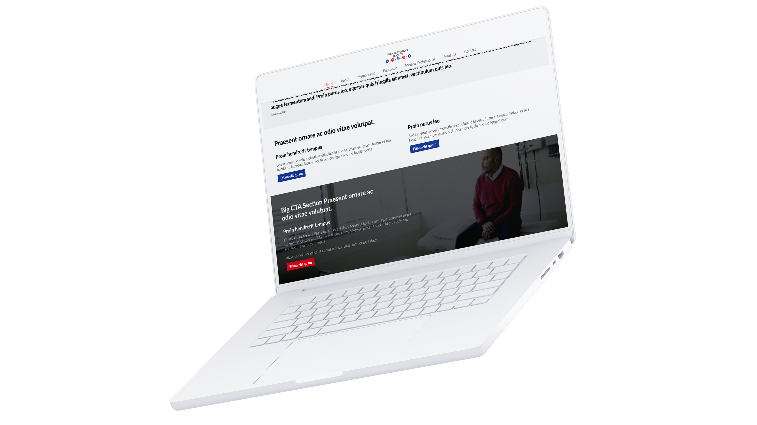
The brand wasn’t exceptionally colourful, but as this was an informational site I decided to use what colours they did have as primary (red) and secondary (blue) CTA colours. The rest of the page was kept minimal to ensure the text was always high contrast and legible for their users.

I built out some commonly used modules. The goal while building them was to make them adaptable and simply constructed for development. I also wanted to ensure the text column layouts would make reading easier on users, I stayed away from single column formats of the regular body copy sizes as many users have problems with text blocks wider than 12-15 words.